Start your day with a WOW
Thursday, April 26, 2012
Monday, January 3, 2011
Bubble Diagram of my Dream House
The entry leads to living room directly as it is the main public spaces in house. From the living room, the dining area is connected. The balcony is related to the living room connect exterior with interior, providing a better quality of viewing scenery. I like the sun shines in into my house in the morning, it gives me strength to start a new day. Thus, balconies are incorporated into the design at the 1st floor too.
Sunday, January 2, 2011
Exterior & Interior Perspectives
Exterior perspective 1
Exterior perspective 2
Exterior perspective 3
Interior perspective 4
Interior perspective 5
Buildings with interesting concepts
Great Blue Whale
Location: Yeosu Expo 2012
Architect: Nicoletti Associati
The pavilion, which was conceived as a Great Blue Whale hurling itself out of the port, intends to represent the Expo’s theme: The Living Ocean and Coast. The pavilion has “a strong and powerful form that would become instantly recognizable. The theme of the Expo is symbolically represented with a shape drawn from marine life. The image of the pavilion is consistent with the theme of the ocean. Its fluid shape celebrates the nature of water and the marine life that has adapted to it. It makes a very simple but powerful metaphorical relationship.
The Heinz Galinski School
Location: Berlin, Germany
Architect: Zvi Hecker
The school was designed based on sunflower. The sunflower is a metaphor, not in some abstract geometry, but because the way the building absorbs the light and projects it inside. The sunflower is actually catching the sun, this, there are no parallel walls in the school to imitate the sunflower pattern, it turns with the sun as the school absorbs the light.
Beijing International Book Mall
Location: Beijing, China
Architect: Beijing Institute of Architectural Design
The Book Mall lies in the northeast of the site. Its name “8 shape building” comes from the diagram used in design to define the space: figure 8. A huge atrium is used to organize four sales areas at different levels. Corridors and steps in the center and end make the whole building into a continuous space, a smooth shape.
Ennis House
Location: Los Angeles
Architect: Frank Llyod Wright
Ennis House was designed by Frank Llyod Wright in 1924. Its inspiration is rather obvious, as Wright’s love for Mayan art and architecture connects this residence to the culture’s highly ornamented, symmetric and organized structures. It was designed based on Mayan culture and concrete blocks were mainly used in the construction to give an authentic feel to the building.
Why concrete blocks? “It was the cheapest (and ugliest) thing in the building world,” says Wright. “It lived mostly in the architectural gutter as an imitation of rock-faced stone. Why not see what could be done with that gutter rat?” Wright takes on the challenge of creating a warm and decorative material out of the standard cold industrial concrete, and achieves this through the carvings of a repeated geometric design.
Ideas for viewing tower (D-Tower)
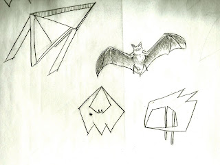
The ideas are basically ''slanting'' + ''bat''. My toy character is Batman who uses Bat as his icon and image. Thus, Bat's wing is the most important element in the design. On the proposed site, there are slanting coconut tress. To incorporate the design into the site effectively, the tower is designed to be ''slanting''.
The tower is located near to the lake to receive more wind and shades as the coconut trees grow beside the lake. Besides that, the beautiful scenery of the lake can be perceived easily from the proposed site.
Subscribe to:
Comments (Atom)


